
You're probably staring at a weekly draft right now, trying to make it feel polished without turning it into a marketing flyer. The headline is tight, the copy is useful, and one or two visuals could make the whole thing easier to scan, but you also know the inbox has its own rules. Graphics in email help the story land, yet they can also disappear, slow down a send, or make an otherwise solid edition harder to read.
For B2B newsletters, that trade-off matters more than it does in a glossy campaign. A reader on a corporate inbox might never see the artful image you spent time on, while a reader on mobile data may punish you for a file that loads too slowly. The safest habit is simple, make the email understandable in live text first, then let graphics support what the words already say, a principle reflected in the guidance on image blocking, accessibility, and deliverability from university email design resources like Salesforce UCM's graphics and images guidance.
Where this fits in a working newsletter programme: See the newsletter strategy playbook, the detail on newsletter cadence for accounting firms, or ask for newsletter service pricing.
Why Graphics in Email Still Trip Up Weekly Newsletters
A weekly newsletter can look polished in the editor and still arrive with half its visuals missing in the inbox. That gap is where most confusion starts. Editors want a credible edition that sits comfortably beside branded marketing email, but inboxes reward clarity, fast loading, and copy that still makes sense when images are blocked, which remains common in many email clients and corporate environments, as the email graphics guidance from Salesforce UCM explains.
The practical mistake is treating graphics like finishing touches. A chart, banner, or logo belongs to the structure of the email, because once it disappears, the reader either keeps the thread of the message or loses it. When the only version of the CTA lives inside an image, the send becomes brittle.
Practical rule: if the email only makes sense when every image loads, the message is too dependent on design.
For a weekly B2B editor, the better model is simple. Write the subject, intro, and CTA in live HTML first, then choose visuals that support the copy instead of carrying it. That also means checking the draft in the conditions that expose weak layouts fastest, a blocked-image inbox, a small phone screen, and a patchy connection.
A useful way to judge the visual mix is to ask what each asset does for the reader. A graphic can create rhythm, show evidence, or break up a dense block of text. Live text can do the heavy lifting for meaning, searchability, and fallback behavior. In weekly publishing, that split usually leads to cleaner decisions than choosing based on style alone.
The best weekly editions usually use just enough visual weight to keep the issue easy to scan, then let text carry the argument. Once that standard is in place, every asset has to earn its place in the send. For a deeper look at how inbox placement and delivery behavior shape those decisions, the newsletter deliverability guide is the right companion piece to this process.
The Blocking Problem and the 60 40 Text-to-Image Balance
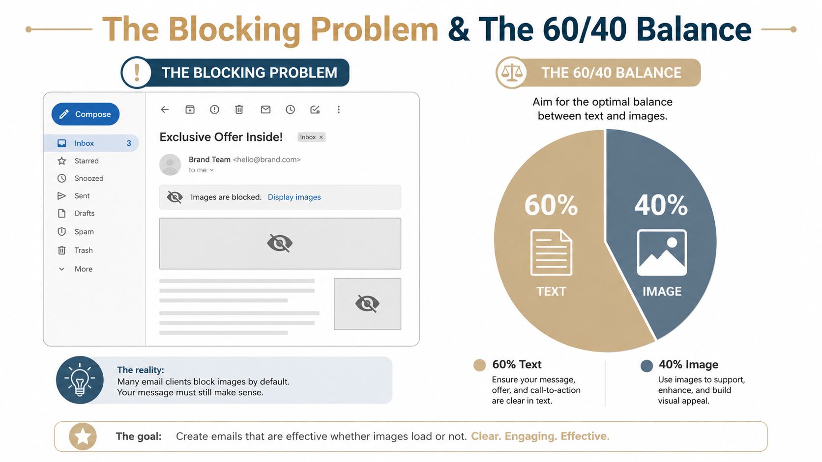
Image blocking is the oldest reason email graphics still need restraint. A lot of email clients still handle images conservatively, and major guidance continues to warn against image-only emails because important content may not render if images are blocked, and image-heavy messages can create spam-filter risk. The long-term result is a best practice that keeps important message text in live HTML, not inside an image file, as outlined in Salesforce UCM's email graphics guidance.
What the 60 40 idea really means
The recurring 60/40 text-to-image balance is not a law. It's a practical shorthand used in industry guidance because it keeps editors honest about hierarchy and readability. If your email has to be understood with images off, then text needs to dominate the structure, while graphics do the work of emphasis, proof, and visual breathing room.
That's the operational test I use with weekly newsletters:
- Lead with live text. The headline, summary, and CTA should all make sense without a graphic.
- Use graphics for support. A chart can clarify a trend, and a banner can frame the issue, but neither should be the only place the meaning lives.
- Keep the CTA visible in text. If the image is skipped, the action should still be obvious.
The right question isn't whether the visual looks good. It's whether the reader still knows what to do if the visual never appears.
The infographic below captures the basic idea well, a blocked-image client on one side, a text-heavy balance on the other. In weekly publishing, that balance protects both deliverability and comprehension, which is why it keeps showing up in editorial guidance. Once you accept that rule, you can choose visuals more confidently, because you're no longer guessing based on aesthetics alone.
Choosing the Right File Type for Newsletter Visuals

The first file choice affects how a newsletter renders and how much work the reader has to do to understand it. For weekly B2B editions, the safest approach is usually straightforward. Use JPG for photographs, PNG for graphics with transparency or line art, and GIF for simple animations only when the motion adds meaning. SVG still creates more uneven results across email clients, so it is not the default choice for a newsletter that has to ship reliably. That format guidance is summarized in Emily.email's email image best practices.
A simple default for weekly editions
A weekly B2B newsletter usually needs only a few visuals, so the decision should be quick.
- JPG for people, places, and real-world shots. A team photo, event image, or editorial portrait usually benefits from JPG because it keeps quality acceptable while staying relatively light.
- PNG for charts, logos, and crisp interface-style visuals. Hard edges, transparency, and text that must stay sharp are all better reasons to choose PNG.
- GIF only for restrained motion. Use it if the motion explains something or adds a useful cue. If the same message reads clearly in a still image, the animation adds complexity without much return.
A practical way to judge the choice is to ask what the visual is doing in the email. A product screenshot that needs crisp labels is doing a different job from a hero photo, and a motion asset does another job again. Weekly newsletters work best when that decision is predictable, because the team can spend its energy on the editorial point instead of on file-format debates.
Why SVG keeps causing trouble
SVG is attractive because it scales neatly, but email clients still handle raster formats more consistently than SVG, as the image best-practice guidance notes. That difference matters when your readers open the same issue across different phones, desktops, and corporate filters. A newsletter that has to go out on schedule every week benefits from a visual stack that is simple and dependable.
A useful default is easy to remember. Photo, JPG. Graphic, PNG. Animation, GIF only if it earns space in the issue. That approach also makes it easier to keep an eye on newsletter performance, because format mistakes stop obscuring the more important question of whether the visual helps the story.
Sizing for a 600 Pixel Container Without Killing Load Speed
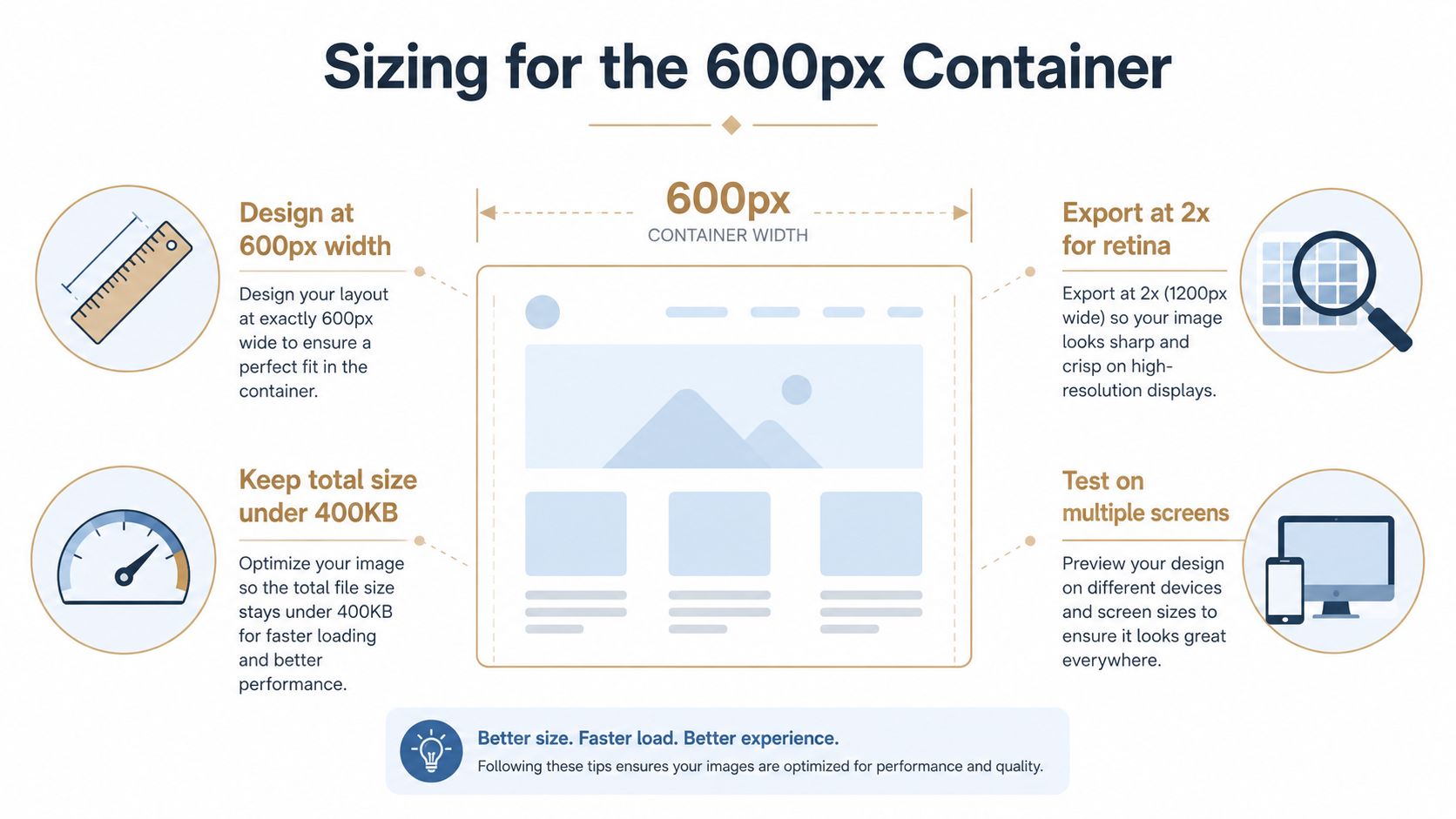
The safest sizing workflow for newsletter visuals is straightforward. Design around a 600 px email container, then export assets at roughly 2x the displayed width, so the image stays crisp on Retina screens while the email itself remains narrow enough to fit common layouts. Multiple sizing guides recommend exports in the 1200 to 1280 px range for 600 to 640 px display widths, and they also warn that file sizes should stay around 100 to 200 KB to avoid slow rendering and client clipping, especially in Gmail, as outlined in Digital Applied's email design size guide.
The export habit that saves time
A weekly team doesn't need a complicated workflow. It needs one repeatable preset.
- Design at the displayed width. Set the canvas or working area to the width the reader will see, usually 600 px.
- Export at 2x. Save the file at about 1200 px wide so the image stays sharp on high-density displays.
- Compress before send. Reduce file weight until the image loads cleanly without making the edition feel heavy.
- Place the size in HTML, not in the image. Let the email code control the displayed dimensions.
That last step matters because the exported file and the visible size are not the same thing. A retina-ready asset can look crisp while still rendering at a much smaller displayed width. The benefit is quality without layout bloat.
Practical rule: if an image looks beautiful in a draft but makes the email sluggish, the file is too expensive for a weekly send.
The broad performance question belongs in the same conversation. A visual that slows the newsletter down can damage the reading experience faster than it improves the design, which is why keeping a tight export habit matters more than polishing one individual asset. If you want to review performance from the newsletter side, the newsletter performance page is a useful companion reference.
Video: Email design sizing walkthrough
A clean weekly edition usually has one rule here, crisp where it matters, lightweight everywhere else. When the image is sized properly, the editor gets both, a strong visual on modern screens and a send that doesn't feel inflated.
Accessibility as a Design Decision, Not a Checkbox
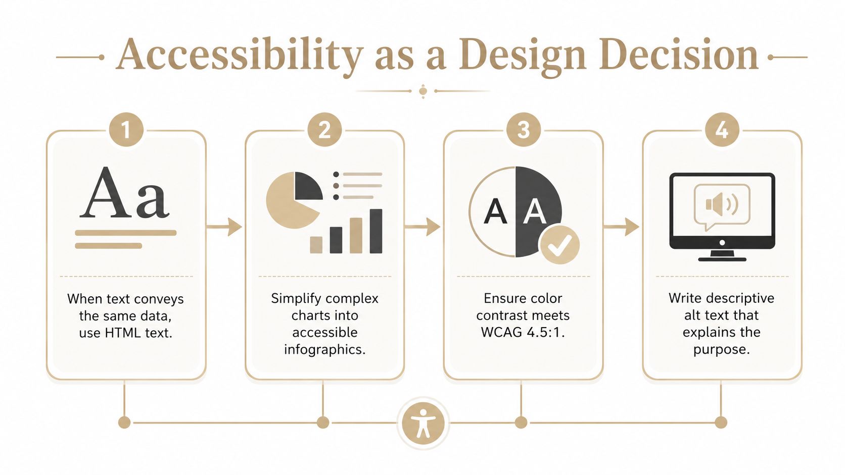
Accessibility is where many newsletter teams stop too early. They add alt text, check a box, and move on. That approach misses the point when a visual carries meaning. The safer standard is simple: keep essential information in live text, use empty alt text for decorative images, and test layouts across devices because rendering varies widely. Elon University's email image accessibility guidance explains the same basic rule set for inbox content.
Use the medium that preserves meaning
The right choice depends on what the visual is doing.
- If the text can say it clearly, use HTML text. A compliance note, deadline, or process step belongs in live copy when the same information can be rendered directly.
- If the visual simplifies a complicated idea, simplify it further. A dense chart can often become a cleaner infographic or a text-plus-image combination.
- If the image is decorative, keep it out of the reader's way. Decorative banners and separators should not add extra screen-reader noise.
That distinction matters in professional services newsletters, where trust depends on clarity. A branded logo strip or a supporting image can stay visual if the alt text explains its purpose, but a chart showing obligations, dates, or comparisons should not hide the only copy of the message inside pixels. The reader should not have to guess whether the image is carrying decoration or the actual point.
A decision framework that editors can reuse
Use this short test before send:
If the image vanished, would the reader still understand the point, and would the next action still be obvious?
If the answer is no, the asset needs a redesign. Sometimes that means moving the information into text. Sometimes it means splitting the idea into a short paragraph plus a simplified graphic. The point is to keep meaning intact for every reader, including the ones using assistive technology or a client that loads images unevenly.
A weekly B2B newsletter needs a repeatable filter here. For a support visual, ask whether the image explains, decorates, or carries required information. An image that only decorates can usually be trimmed back. A chart that carries the message may need live text around it. A simple icon can stay, as long as it does not take over the reader's attention.
This is the part that makes the design standard defensible. You are choosing the format that keeps the message readable and the layout usable across inboxes.
Two Weekly Newsletter Examples Done Right
A financial advisor briefing can use one supporting chart without becoming visual clutter. The chart should summarize a market point, a planning trend, or a portfolio concept, then the surrounding paragraph should explain the implication in plain language. If the images fail to load, the reader still gets the reason the chart was included, because the copy frames the takeaway before the graphic appears.
A law firm update can do something slightly different. A branded header image and a logo treatment may establish tone, while the body of the email carries the substance in live text. In that setup, the visual is there to signal continuity and identity, not to deliver the legal or editorial point. That distinction keeps the newsletter readable even when a corporate inbox strips the design layer away.
What both editions have in common
Both newsletters stay light. They use 1 to 2 supporting visuals per edition, which keeps the focus on the writing and makes the layout easier to scan week after week. That rhythm also helps with internal review, because editors spend less time reinventing the structure and more time checking whether the edition earned its visual choices.
There's a practical reason this works well for B2B newsletters. Weekly publishing depends on consistency, not novelty. A reusable pattern, one hero idea, one supporting image, one clear CTA, is easier to approve, easier to produce, and easier for readers to recognize.
A service like NewsletterAsAService is built around that kind of weekly cadence, with editorial planning, writing, design, and sending handled as a fixed process. For teams that need the newsletter to ship on schedule without turning every issue into a new layout exercise, that workflow fits the job.
The strongest editions don't make the graphic the star. They make the graphic earn its place, and they keep the message understandable when the inbox gives the reader less than ideal conditions.
A Pre-Send Checklist for Every Weekly Edition
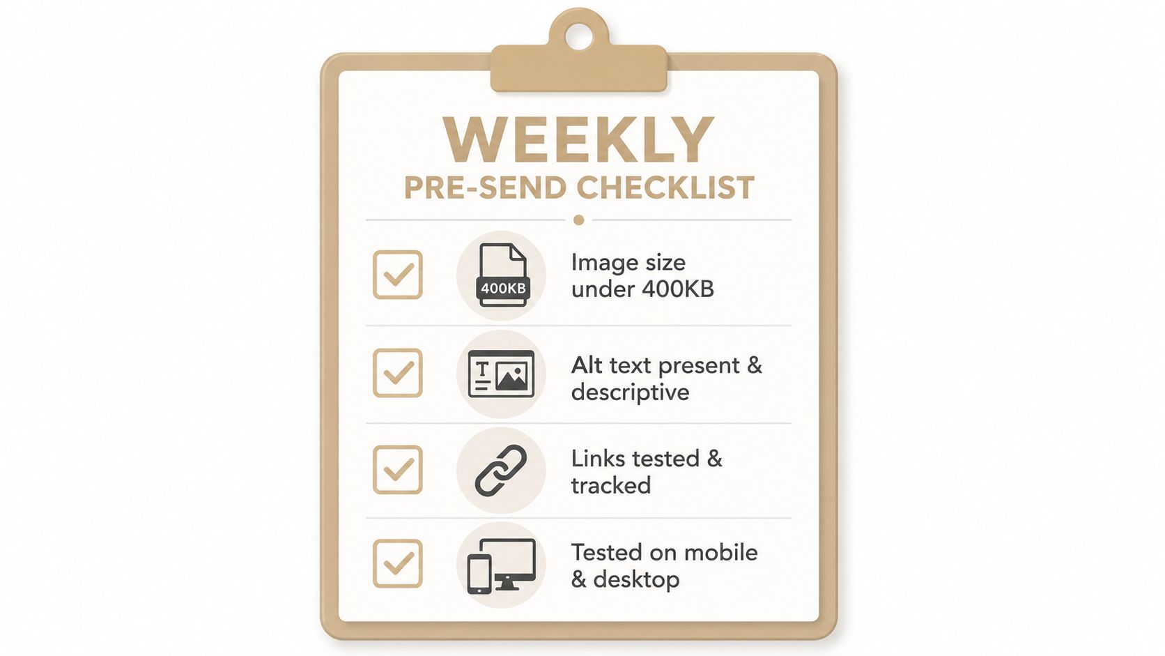
The easiest way to keep graphics in email under control is to use the same pre-send check every week. That habit is simple, but it saves a lot of backtracking when a layout feels off or an asset loads slowly. The checklist below compresses the earlier rules into one fast review, and it pairs well with a broader editorial scorecard like the newsletter grader when a team wants a fuller quality pass.
The weekly review
- Image size under 400 KB. If a visual is too heavy, compress it or simplify it before it reaches the draft.
- Alt text present and descriptive. Write for meaning, not decoration, so readers and assistive tech get the point.
- Links tested and tracked. A beautiful visual that breaks the click path doesn't help the send.
- Tested on mobile and desktop. The same asset can behave differently across screens and clients.
The checklist works because it's focused on the failure points that recur in weekly publishing. File weight, accessibility, and layout behavior are the places where newsletter teams usually lose time. If those are clean, the edition usually ships cleanly too.
Use the list in the same order every week. Start with the asset itself, then the copy around it, then the interaction points, then the render test. That sequence keeps the review practical and fast, which matters when approval windows are short.
Graphics as Supporting Evidence, Not Decoration
The best weekly newsletters use graphics the way a good editor uses citations, as proof, emphasis, or clarification. A chart confirms a trend. A logo anchors identity. An annotated visual helps the reader understand a process. None of those roles require the image to carry the full story by itself.
That framing makes the workflow more durable. You can keep a default export preset, reuse a small visual library, and maintain a short voice guide so branded images stay consistent from issue to issue. Those habits matter more in weekly publishing than one-off campaign design, because consistency compounds while improvisation keeps creating avoidable friction.
If you remember one thing, make it this. Graphics in email should support the writing, not compete with it. When that's true, the newsletter stays readable, accessible, and easier to publish on a fixed cadence.
If you want a weekly newsletter that uses visuals carefully, writes in your firm's voice, and ships without constant design cleanup, NewsletterAsAService can handle the planning, writing, design, and send workflow for your team. It's built for B2B firms that need a steady cadence, clear editorial judgment, and 1 to 2 supporting visuals per edition without turning every send into a production project.
Done-For-You
We write the newsletter. You stay in front of your clients.
One flat rate at $399/mo. Research, writing, and formatting handled for you, in your voice. First edition free.
Get a Free SampleRelated