
When 81% of marketers are already using newsletters and the average newsletter open rate sits at 37.67% across 15.6 billion emails, the question isn't whether a firm should send one. It's whether the newsletter email format makes a partner, client, or referral source feel like they're reading a credible brief, or a dressed-up sales blast. Newsletter benchmark data shows that regular newsletter sends outperform automated emails on opens, which is a strong signal that format and cadence shape expectation, not just delivery.
That matters more in professional services than in almost any other category. Lawyers, accountants, advisors, MSPs, and insurers aren't trying to win a casual click, they're trying to preserve trust, reinforce expertise, and stay visible without sounding promotional. A cluttered layout, tiny body text, or a stack of pushy CTAs doesn't just hurt readability, it changes how the firm is perceived the moment the email opens.
Table of Contents
- Why Newsletter Format Decisions Define Engagement
- The Core Anatomy of a High-Performing Newsletter
- Subject Lines and Preheaders That Earn Opens
- Body Length and Section Structure for Skimmable Content
- Choosing CTA Strategy for High-Trust Audiences
- Mobile-First Formatting Essentials for 2026
- Common Format Mistakes That Undermine Professional Credibility
- Putting It All Together Your Newsletter Format Checklist
Why Newsletter Format Decisions Define Engagement
The first mistake firms make is treating newsletter format like a template choice. It isn't. Format is a trust signal, because readers decide in seconds whether the email feels like a useful professional update or another generic marketing send. If the structure looks chaotic, the message feels less reliable before they've read a word.
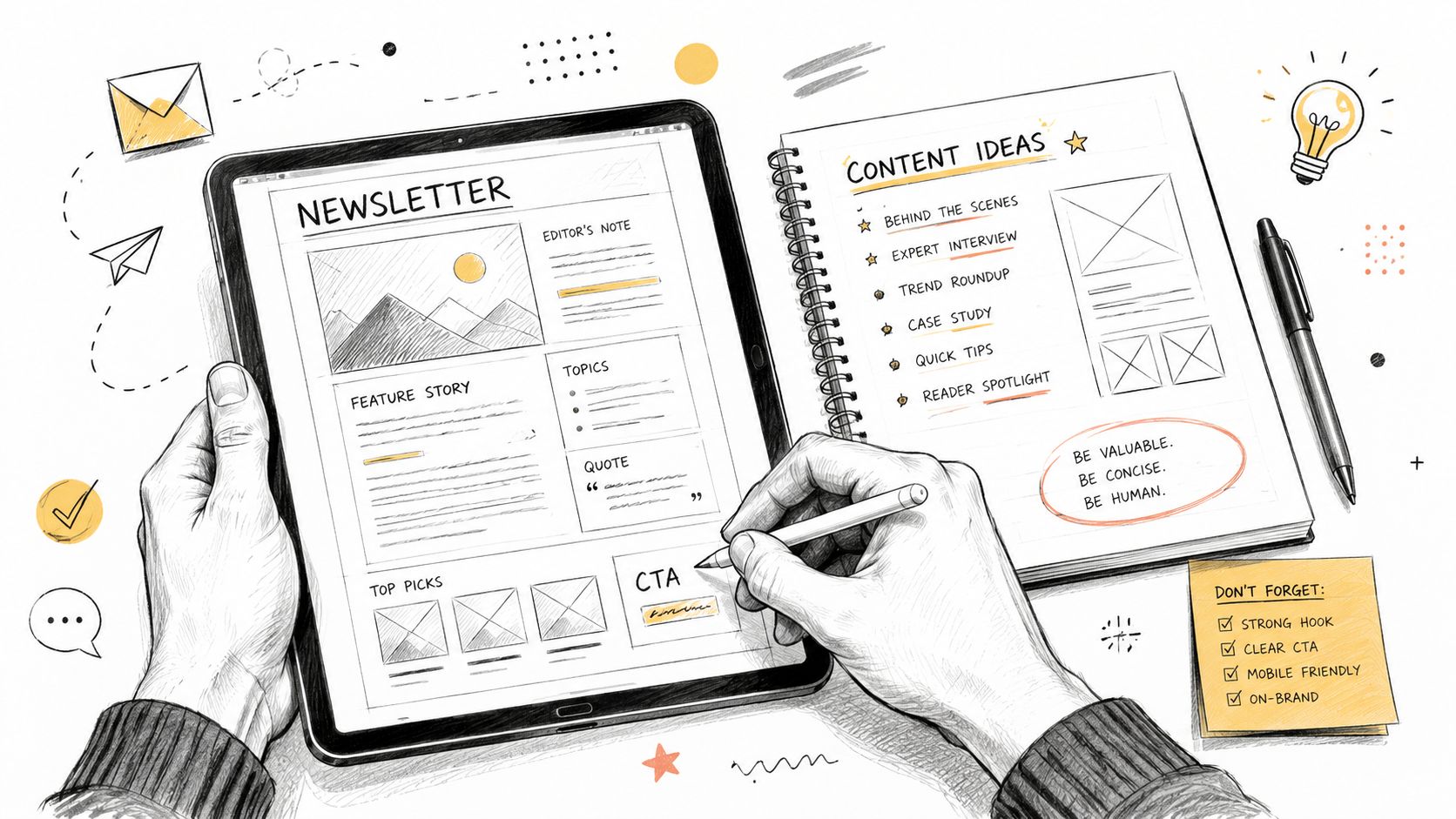
The opening impression matters even more because newsletter behavior is already normalized. With 81% of marketers using newsletters, and newsletter-specific open rates averaging 37.67%, readers have a familiar expectation for what an email newsletter should look and feel like. The benchmark data also shows regular newsletter sends at 37.74% versus 35.12% for automated emails, a useful reminder that a recurring editorial shape performs differently from a one-off blast.
Building a subscription list with the right audience only works if the format rewards attention once people arrive. In professional services, the list is only half the job. The other half is making the email feel credible enough that readers keep opening it.
Practical rule: If the email looks like it was built to persuade strangers, a professional services reader assumes it wasn't built for them.
A poor format creates three visible problems. It overloads the eye with too many modules, it forces mobile readers to pinch and scroll awkwardly, and it often signals an overpromotional mindset. A law firm partner or finance director does not want to hunt for the point. They want the point to be obvious, then supported by structure that respects time.
The Core Anatomy of a High-Performing Newsletter
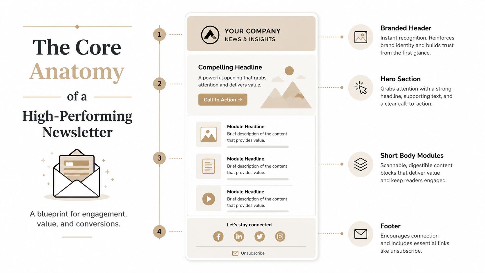
A technically sound newsletter usually starts with a branded header, moves into a hero section with one main action, breaks the body into short modules, and ends with a footer that includes unsubscribe and contact details. That structure is not cosmetic. It lowers cognitive load by giving each part a single job, which matters more in professional services than in promotional email.
The practical width matters too. A single-column layout around 600 to 700 pixels is consistently readable across clients and devices, and it avoids the rendering issues that show up more often in wider templates. HubSpot's newsletter template guidance for professional services makes the same structural case, and it matches what skimming readers expect from a credible firm update.
Header and hero
The header has one quiet but important job, it tells the reader who sent the email before they spend attention. In a high-trust field, that brand recognition should feel immediate, clean, and restrained. The hero section then needs to present a single main idea, not a cluster of competing offers or links.
Body modules and footer
Body modules exist because readers skim. Short blocks, clear headings, and visible spacing let the reader stop and start without losing the thread, which is especially useful for partners, clients, and internal stakeholders reading on mobile between other tasks. The footer earns its place by handling compliance, contact details, and the exit path in a way that feels professional rather than defensive.
The best layout does not ask readers to admire the design. It helps them find the point fast.
The inbox preview also affects how the layout is experienced, especially when a message lands in the primary tab and the reader decides in seconds whether it deserves attention. That means the top of the email has to carry itself clearly before any click. Keep the visual hierarchy simple, avoid overcrowding the header area, and do not bury the main point under decorative clutter.
Professional services newsletters work best when the structure signals judgment. A law firm or accounting firm can have a polished design without turning the email into a brochure. The format should make the update easy to scan, easy to trust, and easy to leave if it is not relevant, because that restraint is part of the credibility the firm is trying to build.
Subject Lines and Preheaders That Earn Opens
The inbox preview is the first format decision a reader sees, and it needs discipline. A subject line should say what's inside, not perform cleverness for its own sake. In professional services, clarity beats intrigue because the audience is screening for relevance, not entertainment.
Use the subject line for the main signal
Three subject styles work well for a serious audience. An insight-first line leads with the issue itself, such as a regulatory shift or market change. A question-based line surfaces a client concern without sounding gimmicky. A concise update keeps the promise tight and direct.
Treat the preheader as a second headline
The preheader should add information, not repeat the subject line. On mobile, it often becomes the second chance to earn attention, so the first part of that line needs to extend the idea rather than echo it. That's especially important in inboxes where the preview pane shows only a small amount of context.
Primary-tab placement affects how the inbox preview is experienced, so the message has to carry itself well before the click. That means no ALL CAPS, no fake urgency, and no boilerplate that trails off into unsubscribe language.
Good test: If the preheader can be removed without changing the meaning, it's not doing its job.
A cleaner formula is simple. Use the subject to name the topic, use the preheader to sharpen the reason it matters, and keep both aligned with the voice the client already associates with the firm. That's how you get opens without sounding like you're trying too hard.
Body Length and Section Structure for Skimmable Content
The body of the email is where format either respects the reader or wastes their time. Most standard newsletter format guidance points toward a short body, and benchmark summaries in the brief point in the same direction. Short, modular, and easy to scan. Mailchimp's newsletter format guidance for professional services and the benchmark summary in the brief both support that approach, while the broad email design guidance from Nielsen Norman Group's email design guidance reinforces the same principle, less clutter and easier scanning. In a professional services setting, that matters because readers are not looking for entertainment, they are deciding whether the message deserves attention.
That does not mean every newsletter should be tiny. It means every paragraph has to earn its place, because attention is brief and readers are usually sorting through inbox tasks. The right structure is one dominant insight, a compact comment on what it means, and a restrained next step. That format gives a partner room to show judgment without turning the email into a memo.
One dominant idea per edition
The strongest weekly issues usually center on one main point, then support it with a few sharp paragraphs. If a partner tries to cover three different topics, the newsletter usually gets worse, not better. A better pattern is to choose one idea, explain why it matters, and leave the rest for future issues.
That approach helps with trust as well as readability. A law or accounting audience can usually tell when an email has been stretched to fit too much content, and the result feels less deliberate. One clear editorial thread is easier to follow, easier to remember, and easier to defend internally.
Use headings, white space, and limited density
Design research from Nielsen Norman Group recommends limiting content density, including no more than two full-length articles in a newsletter and using a fluid template that adapts to screen size. The same guidance is often summarized in that direction, and the underlying principle is consistent, less clutter, more scanning ease. A skimmable layout helps professional services firms keep the message credible because it reduces the sense that the email is trying to do too much at once.
Brevity also affects tone. In a law or accounting context, short paragraphs read as confidence when they still leave room for substance. The goal is not to cram more into the frame. It is to remove anything that does not help the reader decide what matters now.
Choosing CTA Strategy for High-Trust Audiences
Many conversion-focused newsletter templates are built around CTA-first architecture. That makes sense when the email exists to push a click or a signup. It fits less well for professional services firms, where readers are evaluating competence, restraint, and judgment as much as they are reading the content. A newsletter that behaves like a landing page can weaken the trust it is supposed to build.
Single action, soft touch, or permission-based
A single clear action works when the newsletter has one obvious next step and that step matches the issue. A soft-touch CTA fits better when the email is editorial and the value is in keeping the reader informed. A permission-based CTA works when the goal is conversation, reply, or referral, not immediate traffic.
The trade-off is straightforward. More links create more options, but they also create more distraction. A major guide in the brief warns against making newsletters overly promotional, and another notes that too many links can overwhelm readers. In a regulated or high-stakes setting, that overload becomes a credibility problem, not just a layout choice.
Match CTA density to the job of the email
If the newsletter exists to keep the firm top of mind, the CTA can stay quiet. If it exists to move the reader toward a consultation or service page, the action should still read as a recommendation, not a hard pitch. HubSpot's newsletter content-strategy guidance makes the same basic point, the format should match the purpose.
A practical rule is to let the content carry the value and let the CTA confirm the next step. That keeps the message consistent for law and accounting audiences, who tend to respond better when the email feels useful first and promotional second. For firms that want that structure handled for them, NewsletterAsAService plans, writes, designs, and sends weekly B2B newsletters for professional services firms, with the format shaped around weekly cadence and primary-source curation. That model fits firms that need consistency without turning every issue into a sales-heavy email.
Newsletter graphics in email matter here too, because the visual treatment should support the CTA instead of competing with it.
If the newsletter's purpose is retention, your CTA should look like an invitation, not a funnel.
Mobile-First Formatting Essentials for 2026
Mobile is the default reading environment for many inboxes, so the newsletter has to hold together on a small screen without feeling crowded. The technical decisions are not flashy, but they determine whether the piece reads as careful or careless.
Keep size and text readable
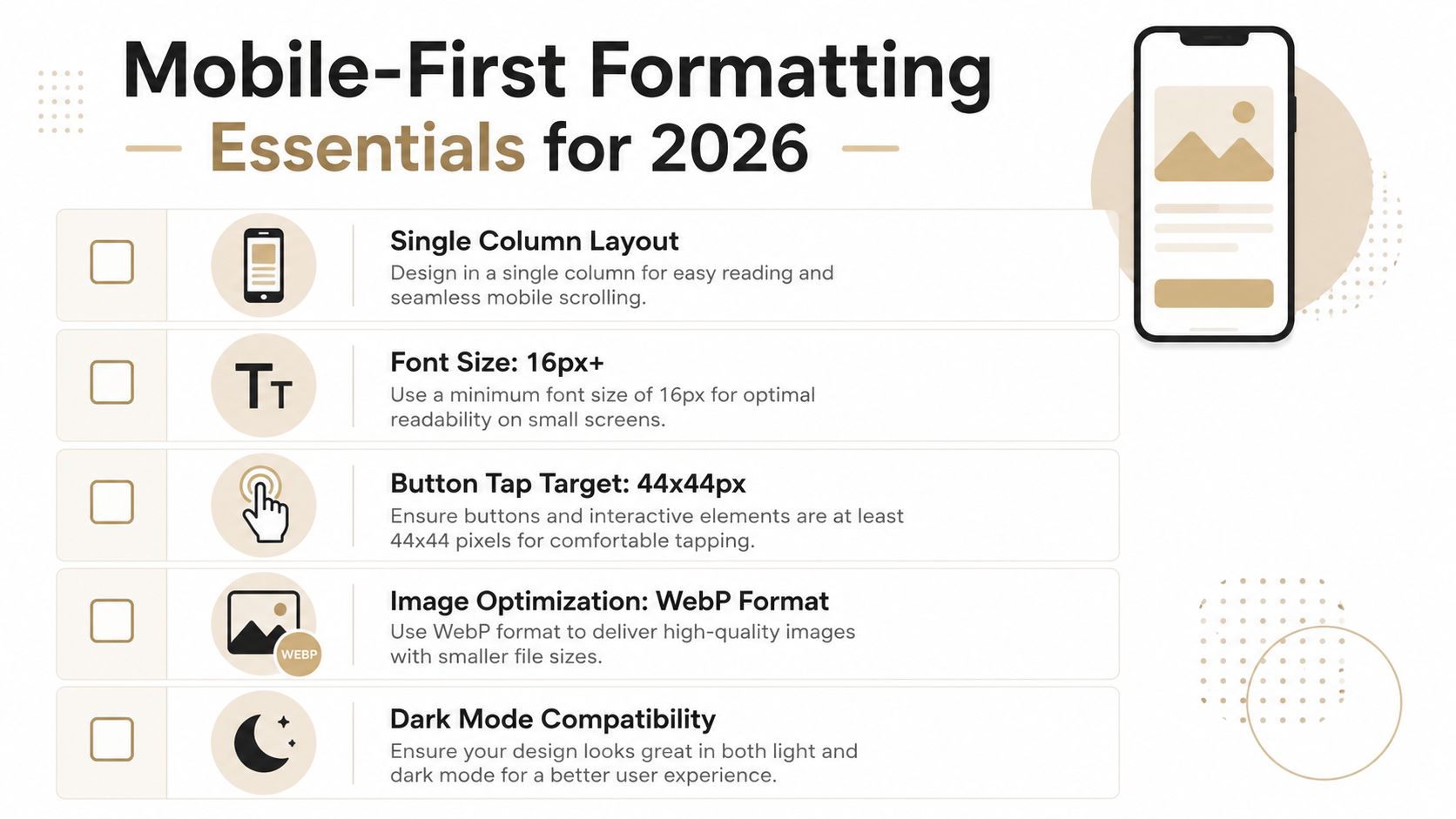
A practical email build keeps the total size under 102 KB to reduce clipping risk in common inboxes such as Gmail. Body text should sit around 14 to 16 px, with 16 px usually the safer choice for smaller screens. BeeFree's email template size guidance for professional services lays out those constraints clearly, and they matter because clipped copy or tiny type makes a firm look rushed.
Compress images and protect meaning
Image files should stay roughly in the 40 to 100 KB range, using JPEG, PNG, or GIF assets, absolute image URLs, and descriptive alt text. Those choices keep load times under control, preserve meaning when images are blocked, and avoid the all-image approach that often weakens clarity more than it improves polish.
Mailjet's mobile email design best practices also point toward narrower widths, roughly 550 to 600 pixels, and a strong text-to-image balance. For a law or accounting firm, that means the email should still read cleanly if every image fails to load.
Restraint in email graphics matters just as much as restraint in the copy, because mobile readers give very little patience to visual elements that compete with the message.
Common Format Mistakes That Undermine Professional Credibility
The most common mistake is the generic template problem. A firm drops its content into a layout that could belong to any retail brand, and the result feels borrowed rather than owned. That may save time, but it also makes the firm look less distinctive and less deliberate.
Four errors that show up fast
- Link saturation: Too many clickable elements split attention and make the reader work harder than they should.
- Font size traps: Text that sits too small on a phone forces pinching and zooming, which reads as careless.
- Inconsistent structure: Changing the section order every week prevents readers from building scanning habits.
- Overbuilt layouts: Too many panels, blocks, and visual interruptions make the email feel promotional instead of advisory.
The fixes are straightforward, but they require discipline. Limit the number of links, keep the type comfortably readable, keep the layout stable from issue to issue, and strip out anything that doesn't support the main point. That's how the newsletter starts feeling familiar in the right way.
A useful diagnostic is simple. If the format changes every week, the reader spends energy reorienting instead of absorbing. If the content is good but the shape is messy, the firm still looks less trustworthy than it should.
Putting It All Together Your Newsletter Format Checklist
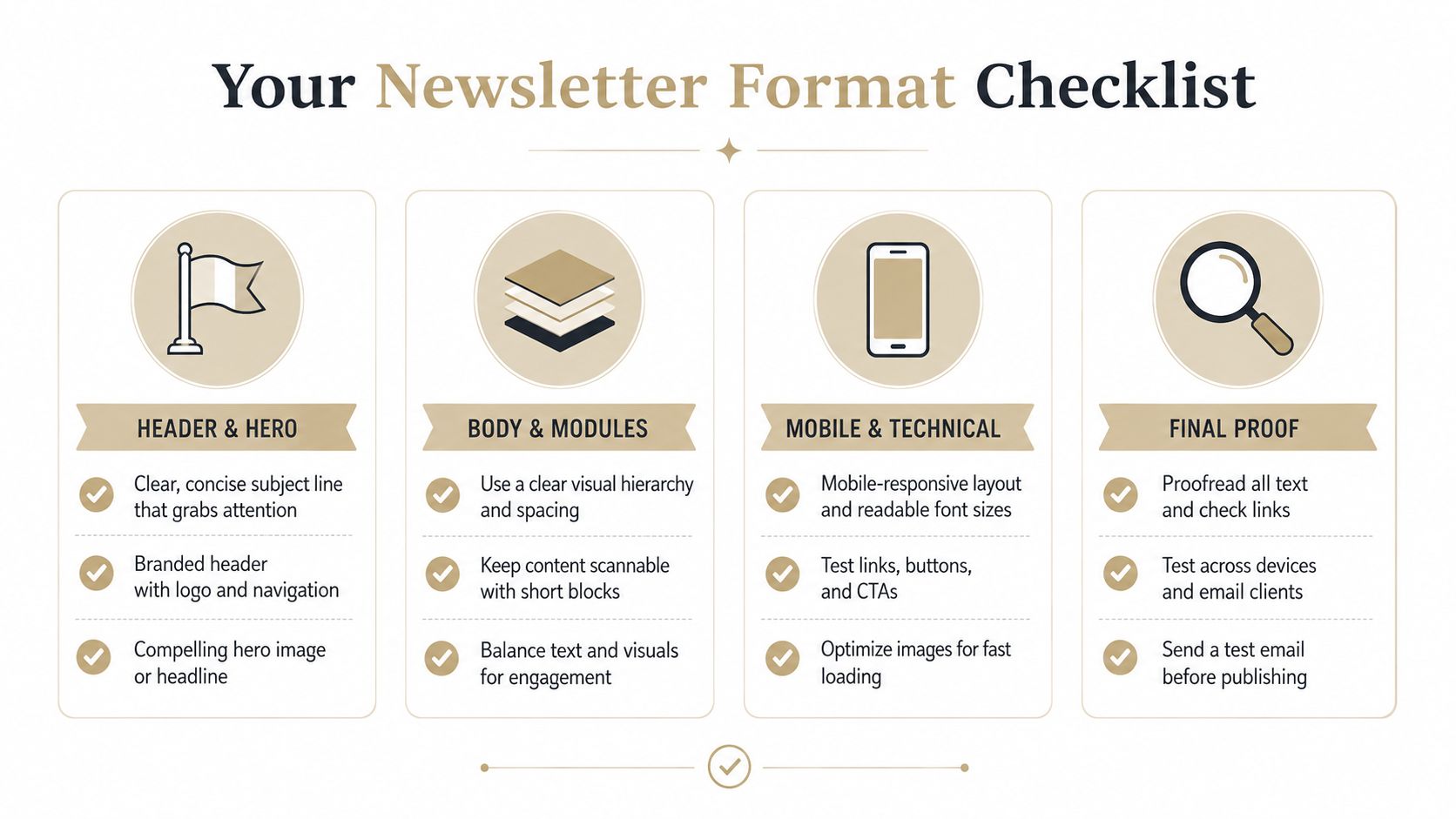
A usable newsletter email format should pass a simple test before every send. The inbox preview should be clear, the layout should be single-column and branded, the body should be short enough to skim, and the mobile version should still read cleanly when images are blocked.
A quick pass-or-fail lens
- Header and hero: Is the brand obvious, and is there one main idea?
- Body and modules: Is the content broken into short, readable blocks?
- Mobile and technical: Is the email within size limits, with readable text and compressed imagery?
- Final proof: Does the footer handle compliance, contact details, and unsubscribe cleanly?
That checklist matters because format decisions compound. A firm that sends a consistent weekly newsletter with a restrained structure trains its audience to know what to expect, and that expectation is part of the value.
If you want a weekly newsletter format built for a law, accounting, advisory, or insurance audience, NewsletterAsAService plans, writes, designs, and sends the edition from your client account on a fixed cadence. It's a practical way to keep the structure tight, the voice consistent, and the work off your team's plate.
Done-For-You
We write the newsletter. You stay in front of your clients.
One flat rate at $399/mo. Research, writing, and formatting handled for you, in your voice. First edition free.
Get a Free SampleRelated